
Complete Visual History of USPS Label 228
The greatest federal arts program since the WPA is making moves

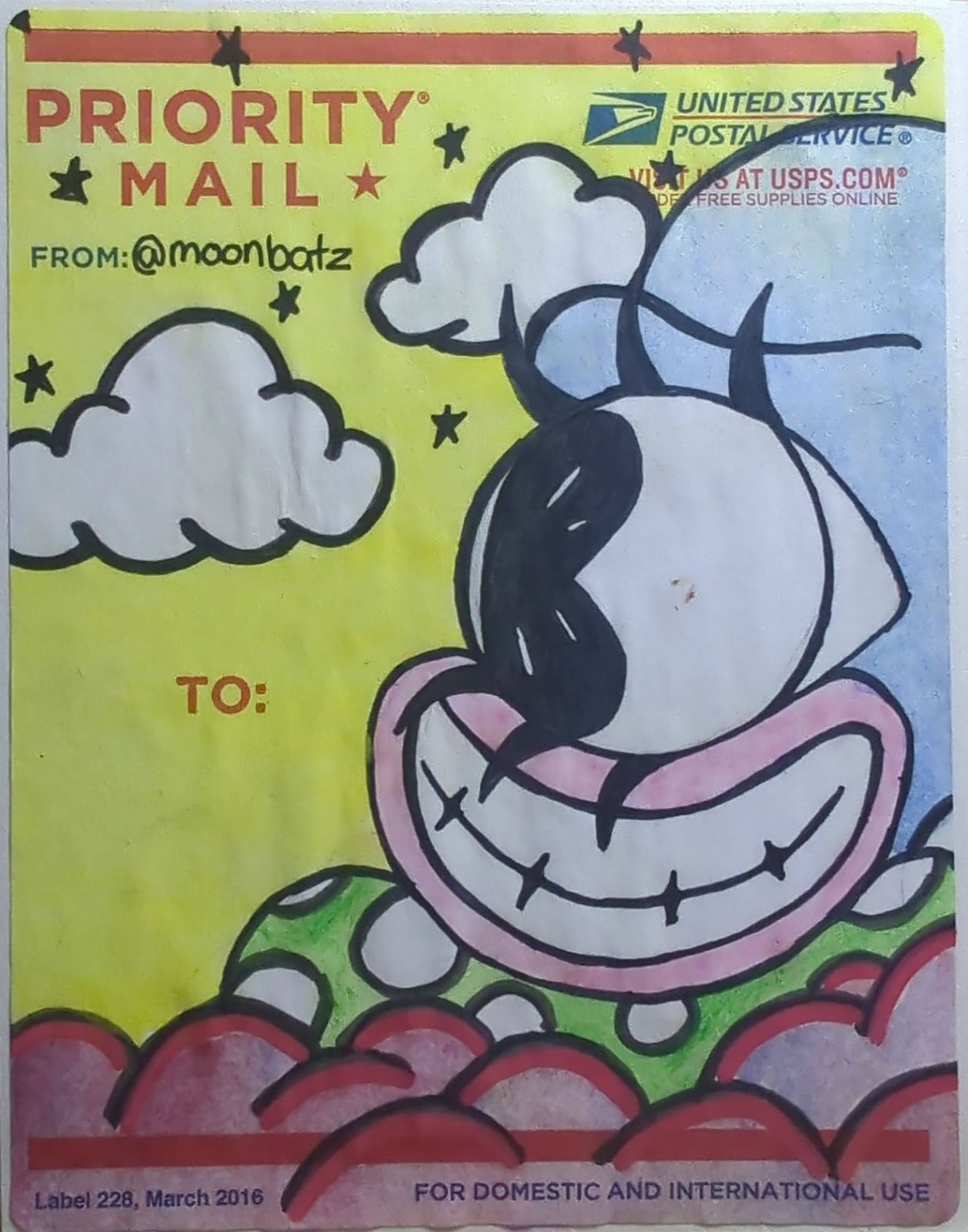
Last month @ Shawn-Laree and I noticed a new slap posted up. We always keep our eyes peeled for new pieces of Arte Agora, but this one was slightly different in a way that was hard to catch at first.
On further inspection, we realized that this was a new version of the March 2016 Label 228 to which we’ve grown accustomed and attached. The “Priority Mail” text was at the top right instead of the usual prominent top left, and the month / date text at the bottom indicated that it was published by the USPS in December 2023.
This was news to us.
Cue wikipedia
I searched for information about the history of Label 228. The Wikipedia article covers its role in the graffiti movement, but there was no single place with a cohesive visual history of the art material so many have used for so long.
What I did find was good images of each of the labels at Sticker Museum. It’s an amazing resource—here’s a search for all they’ve got as it relates to 228s. All of the images I show here prior to 2016 are from their website.
Ordering supplies
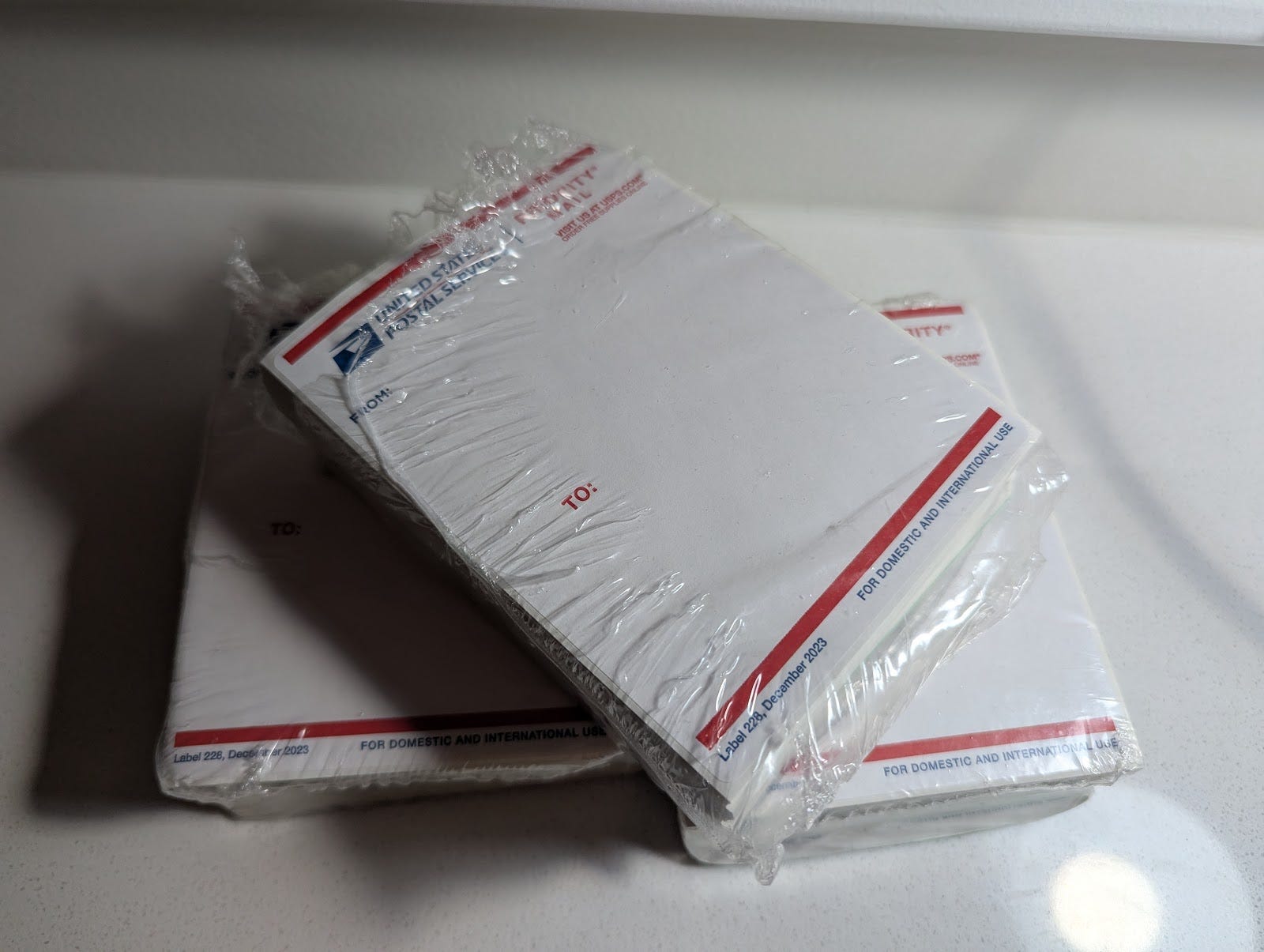
The next step was to head over to the USPS website to order labels. Anyone can order up to 750 labels free of charge. We had just re-upped on labels in May 2024 and the entire set contained the usual March 2016 labels. This new order contained only the December 2023 version, so we knew that a new era had begun.
I edited the Wikipedia article to add the December 2023 version. Since I don’t have first-hand knowledge of previous versions, I thought I’d lay out the visual history here and invite others to add their voices. Again, all of these images are taken from the Sticker Museum website.
Pre-228 history
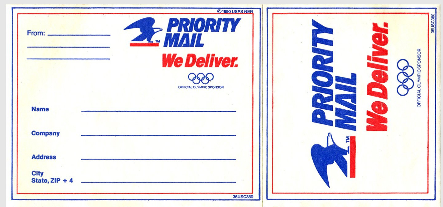
This 1980 “Miracle on Mailing Device” USPS Olympics Postal Label has an early eagle mark (it was only 10 years old at the time) and the phrase “Priority Mail” is displayed in the distinctive forward-leaning type with the triangular A.
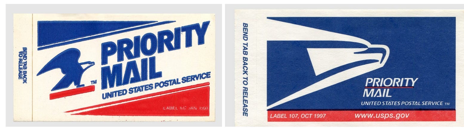
In the early 1990s USPS Label 107 was the go-to priority. Again, the basic visual building blocks are there. The January 1991 label was the last appearance of the red-underlined eagle, which was replaced by a more stylized eagle in 1993. The usps.gov URL makes an appearance by October 1997.
July 1995
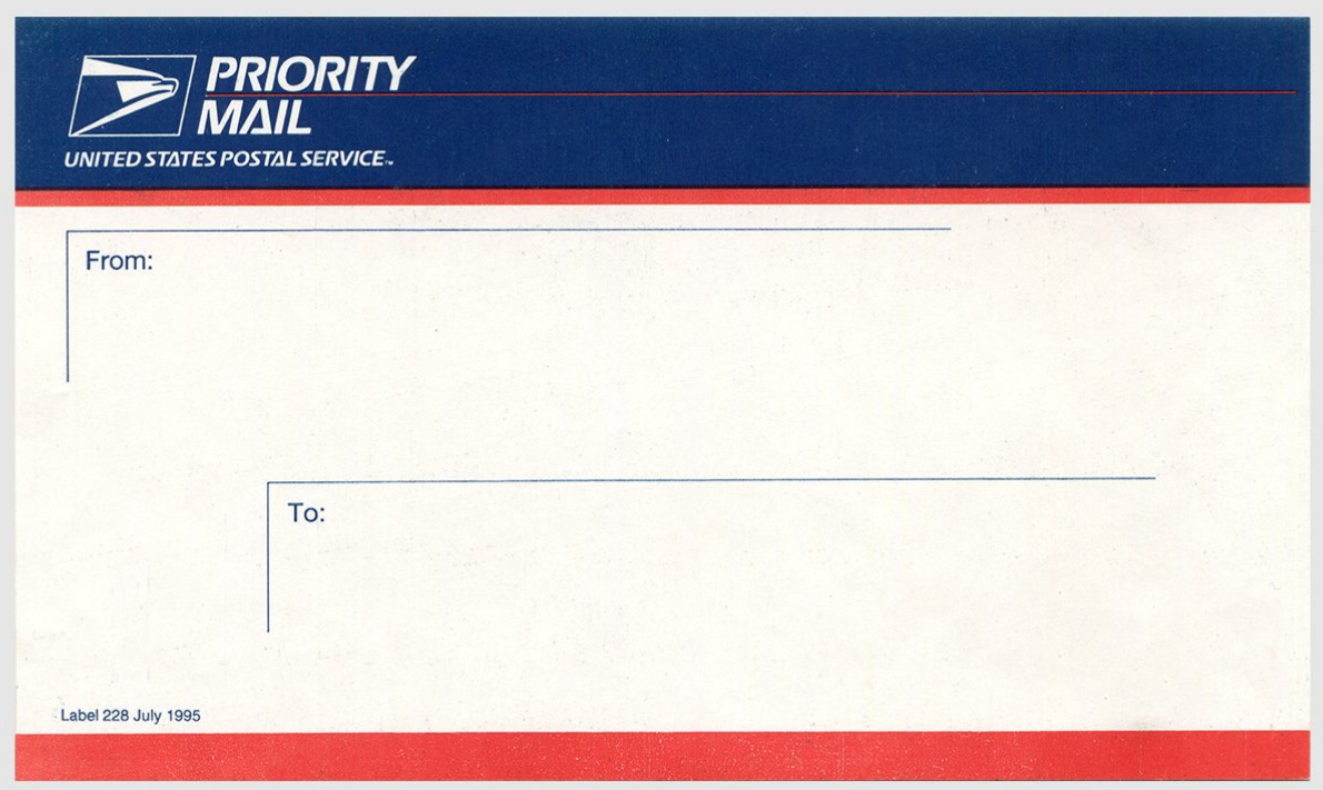
The first USPS Label 228 has shadow-like outlines for “to” and “from” that have the feel of a green screen computer interface.
July 1996 and August 1997
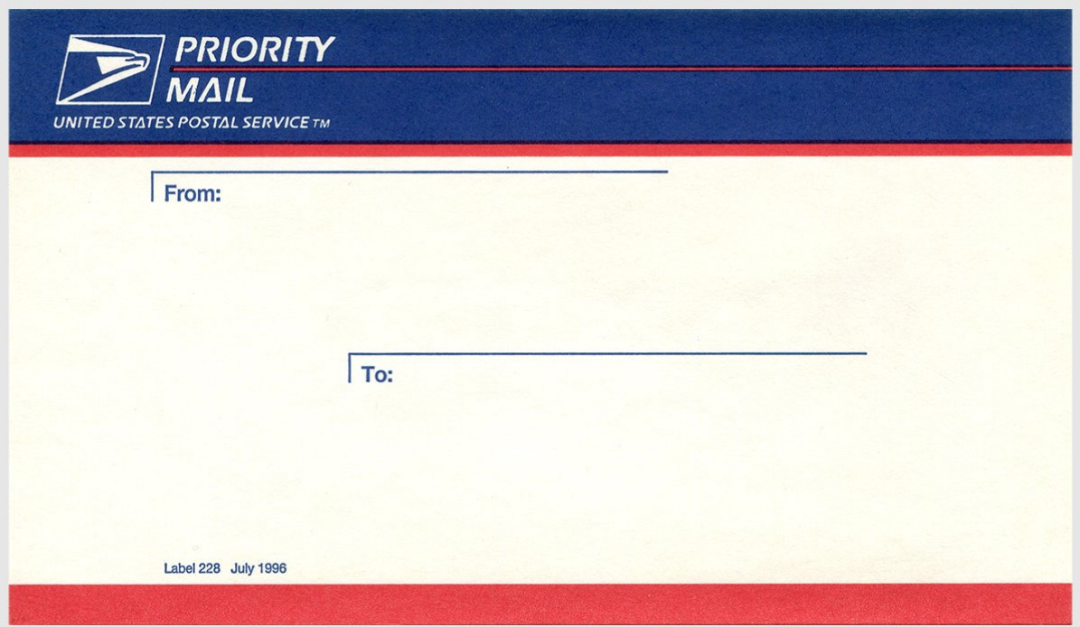
The main change here is making the “entry box” less prominent.
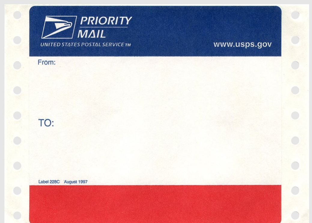
Here’s the introduction of the 228 with perforations designed to work with a dot matrix or continuous feed printers.
January 1999
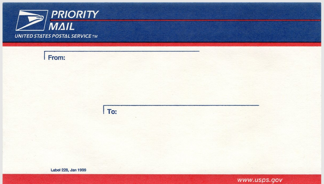
This is basically a re-issue of the July 1996 label for the non machine-fed market.
August 2000
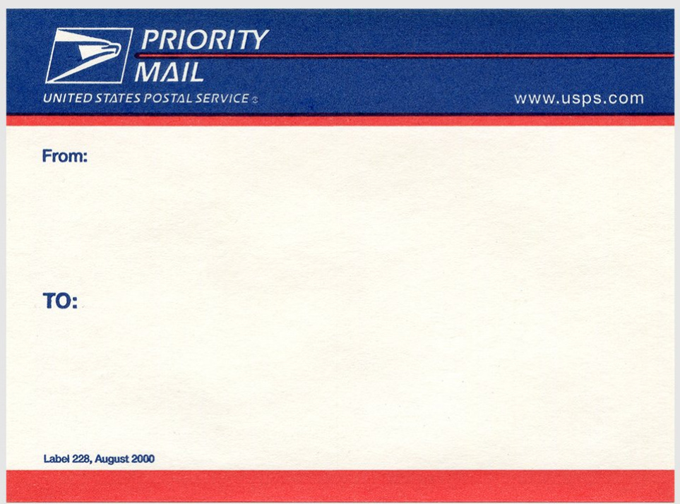
A modern take with a prominent “TO.”
September 2001
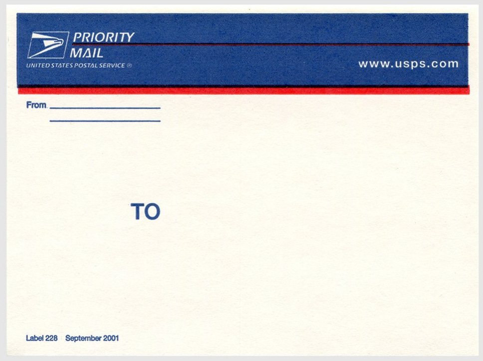
For some reason they added two lines for the “From” line with zero chance of anyone legibly placing an address there.
July 2002
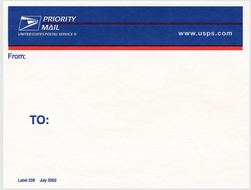
Big TO
September 2002
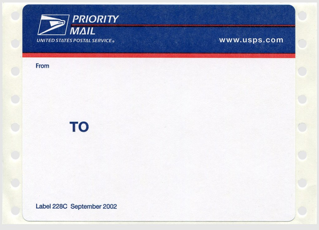
Thermal printing ftw.
June 2004
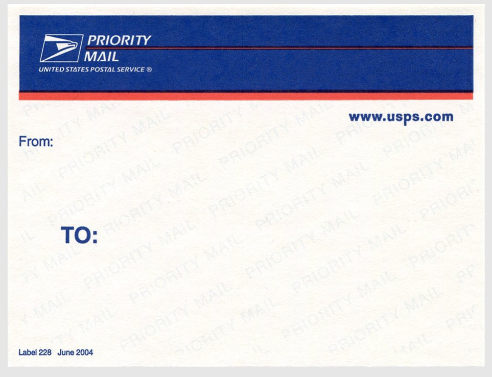
First appearance of tilted “Priority Mail” watermark.
February 2006
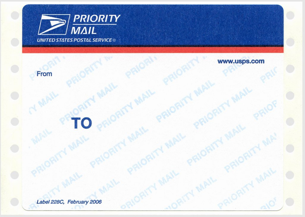
Watermark + thermal printing.
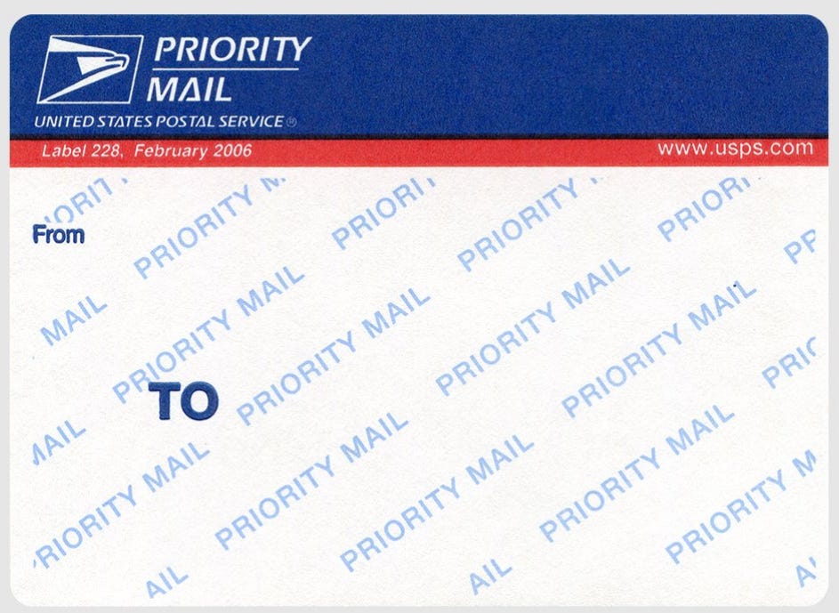
… and non-printer version.
January 2008
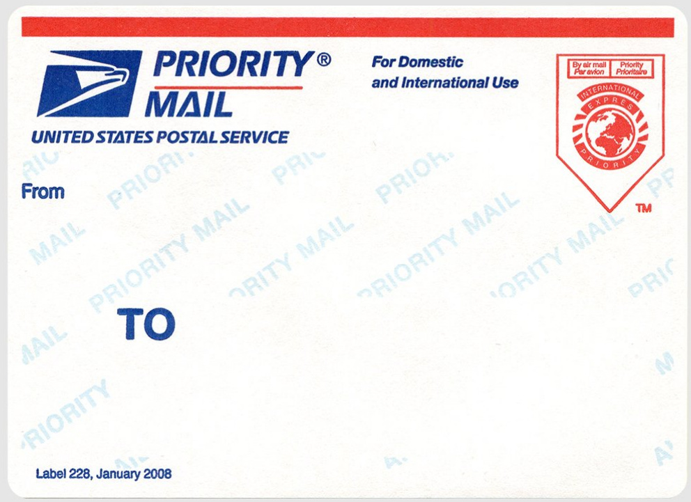
The addition, in the upper right, of a visual international component, along with the first appearance of the phrase “For Domestic and International Use.”
July 2013
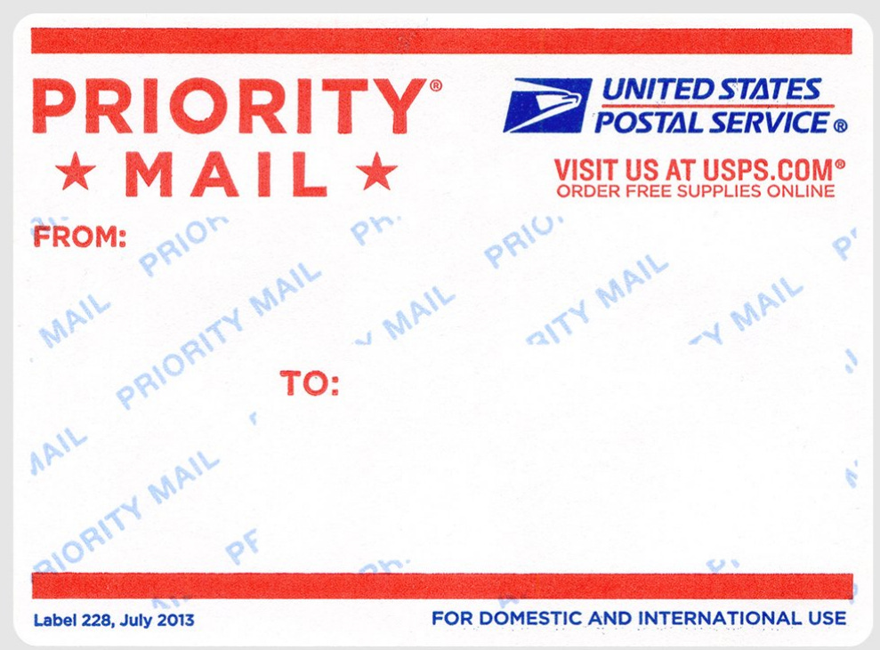
The addition of a watermark, removal of the international iconography. The last of the landscape labels.
March 2016
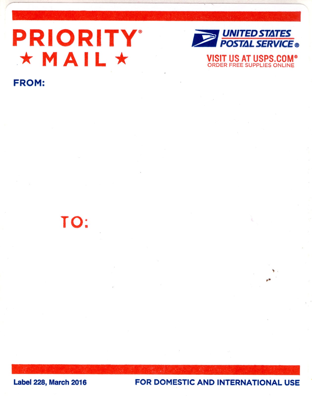
The first portrait orientation, with dimensions that map to 18 x 24 posters.
December 2023
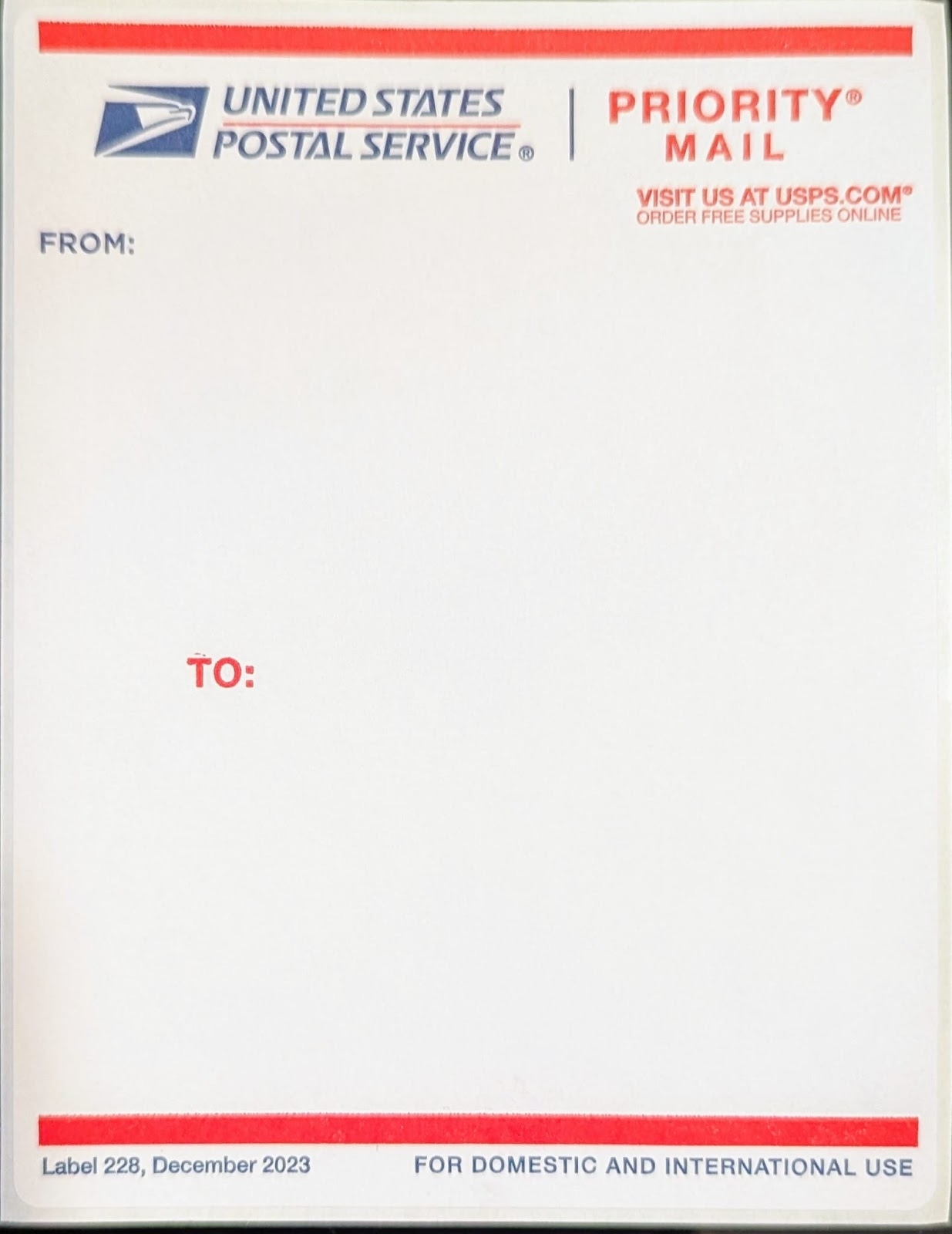
A light redesign swapping the two graphic elements at the top.
Long live the United States Postal Service.
Is this saying that 95 was the first 228? If so, they started before that, I still have some from 92 and 93. Also I wouldn't use that site as a reference..